size? Series – Supermundane

Share This:
The next artist we’d like to present as part of our size? Series is Rob Lowe, who works under the alias ‘Supermundane’. Based out of South East London, Lowe is a full-time illustrator and artist with 20 years of experience in the industry. Supermundane works within an abstract style of illustration using geometric images – playing with lines, colours and optical effects. Rob started working in the industry in 90s, training as a graphic designer before starting at SleazeNation magazine, later to become art director. Since then Lowe has continued to work in graphic design, now working out of his own studio in Havelock Walk, an artists’ community in South East London. Rob’s work takes inspiration from everything from poetry and music, to cold water swimming. In the lead-up to the general election, Lowe, a politically minded artist released a series of free to download posters, encouraging people to print them out and post them in places where they would be visible for others to see.
Supermundane’s style has been described as intricate and distinctive, using simple lines and colour to create abstract pieces that are immediately recognisable and unique to Lowe. Rob Lowe’s illustrations have appeared in some of the most well-known publications in the world, such as the New York Times and the Guardian. Supermundane has also been commissioned to design murals, including one for Great Ormond Street Hospital, of which the artist is particularly proud of. Rob is also art director of Fire & Knives, a food and lifestyle magazine released quarterly. Other clients include; Arts Council England, Apple, V&A, Penguin, HP, Liberty, Dolby Sound and Little White Lies magazine.
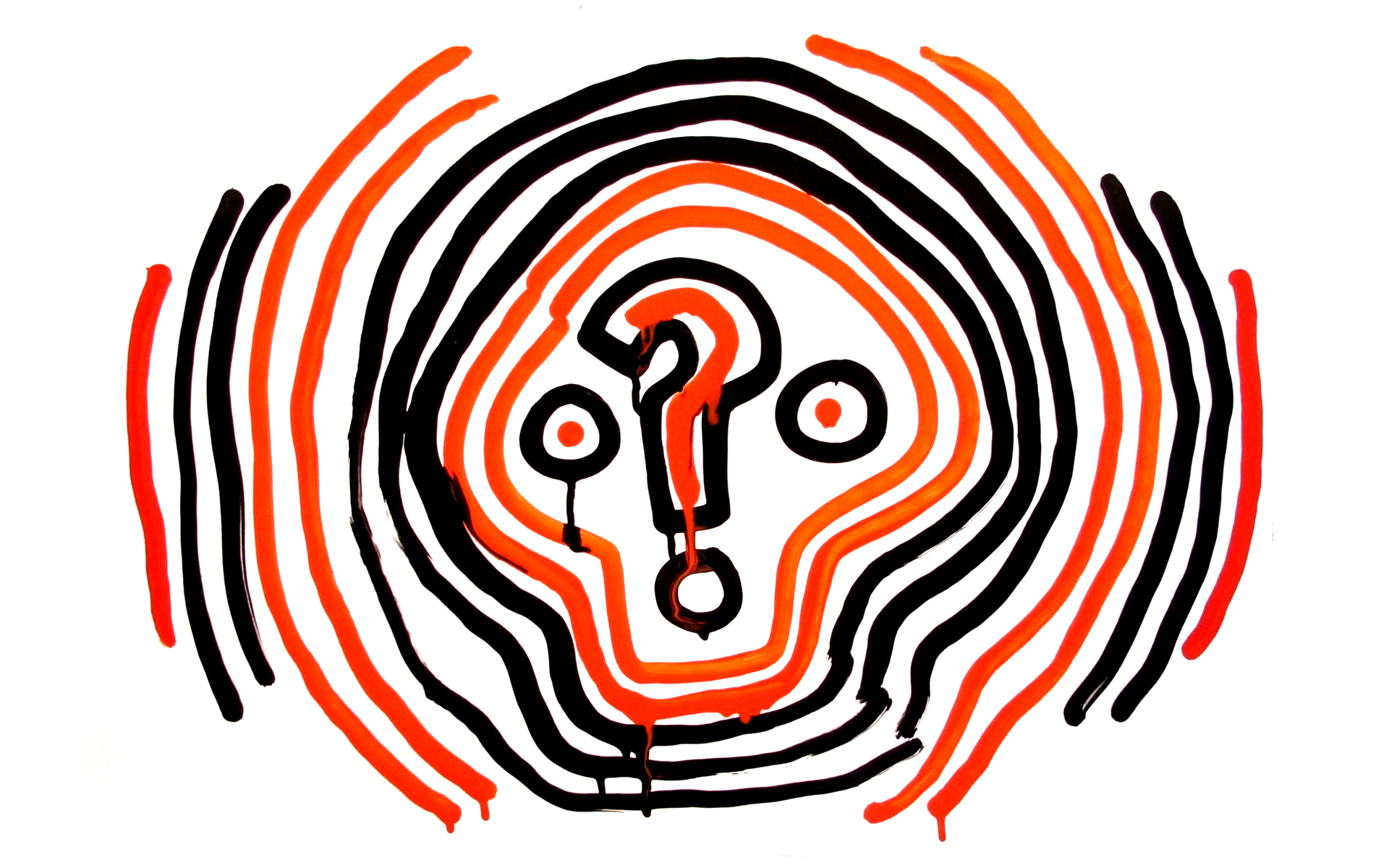
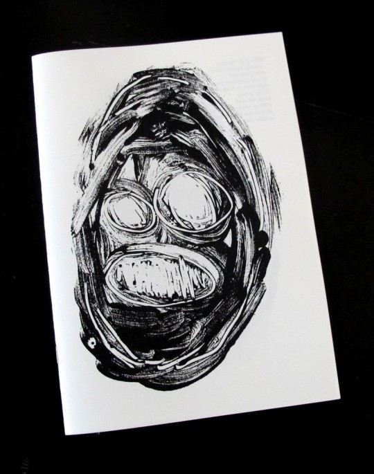
Taking inspiration Rival Consoles’ Howl album, our icon has been illustrated in Krink ink, which is designed to drip. The question mark is at the centre of the piece, depicted in Rob’s signature style, using lines and vibrant colour to create a piece that resembles a confused skull. Which echoes the feeling of political and cultural instability we’re currently experiencing.
To find out more about his piece and work at large, we caught up with Supermundane:
Hi Rob, could you tell us a little bit about yourself and why you work under the alias ‘Supermundane’?
I trained in graphic design in the late 80s and early 90s but now work as a graphic artist. The name Supermundane came about as way of hiding behind something and I liked how it sounds
It’s been a useful name as it’s memorable and a bit funny.
You’ve been an active illustrator for around 20 years. Do you feel the introduction of social media has had a positive or negative effect on your craft, and how have you adapted to it?
I’ve been all kinds of things in the last 20 years including a graphic designer and magazine designer. I’ve never really thought of myself as an illustrator as such as, I don’t do that much that I would class as traditional illustration. The introduction of social media (especially instagram) has been very useful for me. It gives you direct access to people all over the world and also a space to experiment and test ideas. I get quite a lot of work directly through instagram now as well. The downside is the grip it has on you, I feel like I check it too much, and the vastness of it all. There is no context to anything and things that have taken me years to developed can be easily be copied
You have a distinct style of illustration unique to you. How did you come to develop this style of working? Has it changed much over the years?
My work has changed visually of the years but the basic approach is the same. My work used to be much more hand drawn and detailed but I felt I had reached a dead end with it. At that point I looked a new ways to approach my work and it all became more geometric and colourful. I’m sure it will change again. The main thing is having a consistent approach, the look and style are not as important as they can always develop and change.
You’ve created works for a long list of notable clients. Could you single a project out that you’ve particularly enjoyed working on?
Most of the jobs I work on now are enjoyable. I enjoy jobs where I get to explore new ideas, the murals I have designed for Great Ormond Street Hospital fall into this. I worked with children to create repeat patterns that I used as inspiration for the patterns I used in final design. The result was something that moved my practice on and produced something that I wouldn’t have done if I hadn’t worked with the children.
How inspiring is it to work in Havelock Walk, within a community of artists and creatives?
Havelock Walk, where I live and work, is a great place. I feel like it’s an ideal way of living: I know all my neighbours, we have different skills to share and there is always someone around to have a chat with.
We have our open studios as well (the winter open studio is next weekend the 25th & 26th Nov) so the street turns into a festival feel with music and food and lots of art?
What currently influences the work you produce?
I’m influence by all kinds of things from a poem to taking up cold water swimming (which has been the best thing I have done in years). I’m always looking and thinking and trying to move my work on.
At the moment I’m working on an exhibition next year in Belgium that will have 71 prints each with a lyric from a song that means something to me. Music has always been a big inspiration to me.
Do you have any interesting projects you’re working on at the moment that you could tell us about?
I never know what I’ll be working on from one month to the next. At the moment I’m working on the exhibition – as I mentioned, a huge mural that’s going to be painted in New York in December (not by me), an installation piece for an agency, designs for a carpet catalogue (which is more interesting than it sounds) and lots of other personal projects and other things.
Could you give us an insight into the processes you went through to develop the piece you’ve presented for our size? series? Also, what inspired the piece?
The size? piece is in a similar style I used for an exhibition called ‘Stupid Nature’ and the cover of Rival Consoles album Howl. The image is draw large in a Krink ink pen which is designed to drip. I started my drawing with the question mark and have the lines come out from that. I noticed when I did this the shape that it made resembled a skull/head. With the edition of two circles for eyes the image felt finished. It seemed to resonate with me my feelings about the times we are living in. Everything is so uncertain and crazy that this image seemed to sum up that for me.
Share This: