size? Series for size? Camden opening

Share This:
To celebrate the opening of our new Camden store we’ve commissioned three London based creatives to portray our iconic question mark in their own unique style.
Nigel Howlett
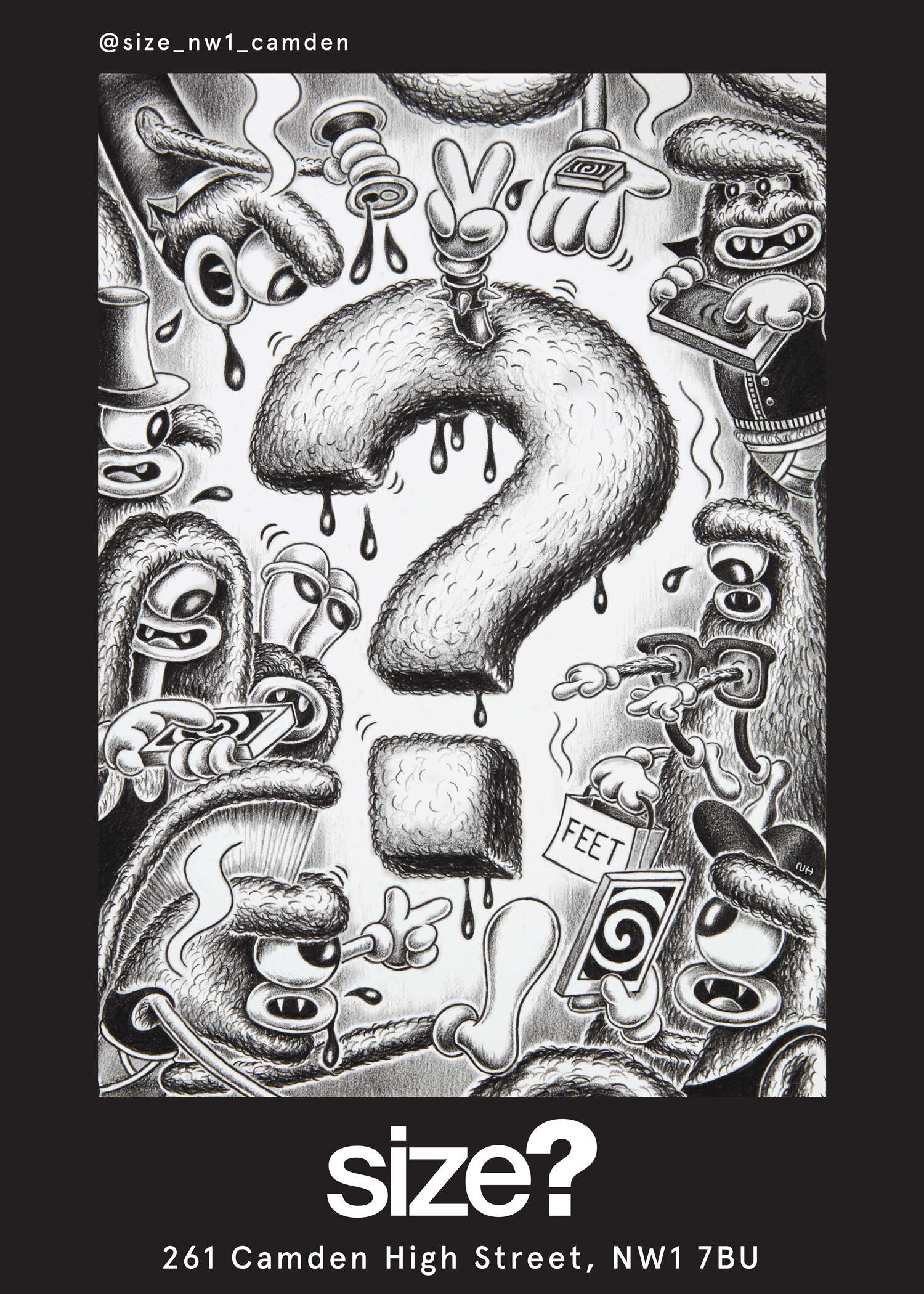
Hackney based Nigel Howlett is an art director, illustrator, set designer and co-founder of creative workshop ‘Nan studios’. Howlett implements a cartoonist style in his work, utilising the pencil for drawings that depict hairy characters, often subjected to awkward, social conditions. Howlett’s illustrations commentate on our fixation with technology and social media.
Howlett has presented our icon in his signature graphic style, calling upon some old, familiar characters for the piece. Central to the drawing, our question mark has been illustrated in Nigel’s typical hairy style, surrounded by punk-looking, Camden-esque characters.
We spoke to Nigel about his work and how he’s interpreted of our icon:
Hello Nigel, could you describe your style of illustration for us?
The drawing series I have been working on for the past year or so is quite detailed black & white tonal work, it’s mostly drawn from my imagination. I work in a cartoony style, and things like hands, cans or clothing are be suitably simple.
A lot of your work is within set design. How does this creative process differ from illustrations?
My Set design projects normally involve a lot more people, I have a big team I draft in depending on the job. Often and especially on commercials a clear brief and creative idea has been worked out before I’m approached. My job is to interpret this and then create the look and feel and make sure it all works and can be done in the time and for the money.
With my illustrations it’s a lot more personal. The work has evolved to have a narrative that runs through it, so for commercial work depending on a brief this can be dialed up or down.
You use the human condition in your illustrations. Is this a heavy influence on your work?
The human condition is my biggest source of inspiration, collective anxieties but also feelings I can’t quite explain. I love the energy in the surreal and cartoony paintings of Peter Saul. George Condo’s paintings rock, Robert Crumb is the king, Julie Tuyet Curtiss… wow love her hair, Louise Bonnet for big noses, and the incredible strange and disturbing films by Rachel Maclean.
Could you tell us a bit about your interpretation of our question mark and how Camden influenced the design?
It’s kind of like I called up some of my characters on the phone and asked if they wanted to come hang out for the day with a size? logo. They are doing what they do. I Tried to make the logo the main focus and I thought I should make it hairy like my characters. I’ve introduced some grungy punky looking dudes, the kind you see hanging out around Camden. I really enjoyed making it!
Joe Prytherch
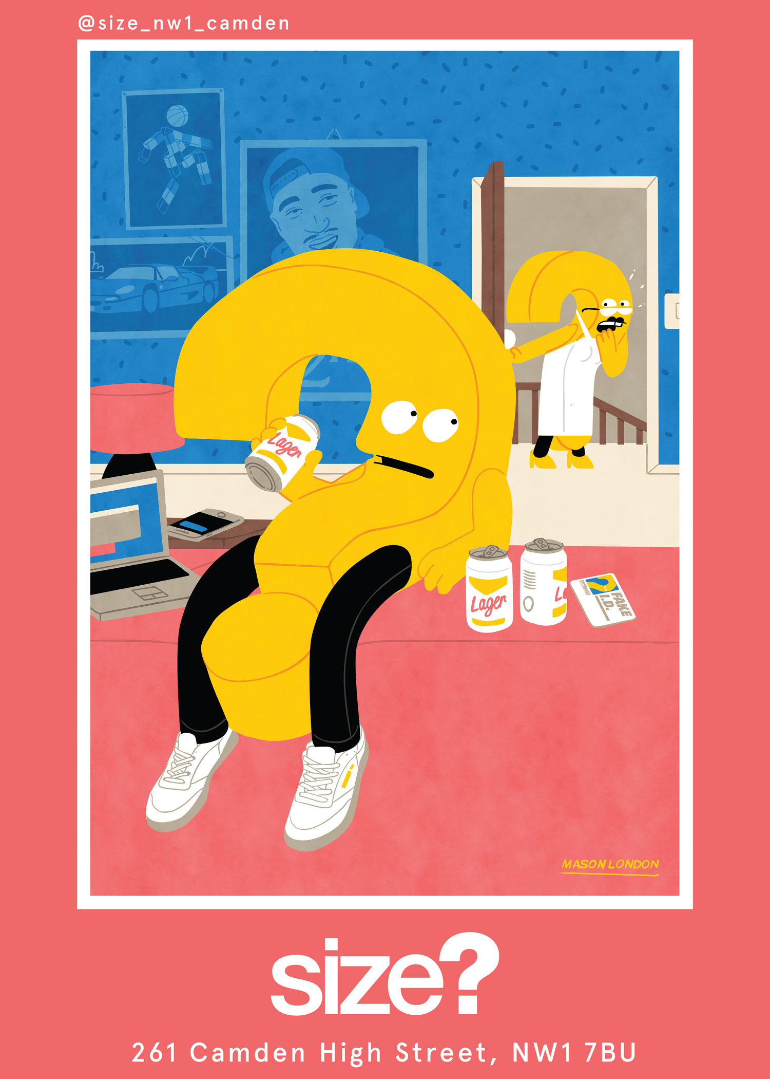
Joe Prytherch is a London based freelance designer, illustrator and former art director of The Boiler Room. Prytherch utilises a cartoonist style, referencing popular culture in his illustrations. Joe has produced illustrations and animations for a varied client list that includes The New Yorker, NTS Radio and the Air Jordan brand.
In a cartoonist style, Joe Prytherch has depicted our icon fresh from a trip to Camden Town with a Fake ID and alcohol, presumably picked up from his trip. The piece is littered with references Joe associates with Camden growing up.
We caught up with Joe to find out a bit more about his work and his perception of our iconic question mark.
Hello Joe. You illustrate under the name Mason London, where does this pseudonym come from?
When i decided I wanted to start uploading my illustrations to the internet, I was working as a graphic designer and I didn’t want to illustrate under my own name incase my drawings were terrible and torpedoed my graphic design career. A lot of my illustration heroes used pseudonyms – people like Dust La Rock, So-Me and Parra, and so I made one up for myself to imitate them I guess. I picked Mason because it was nice and short and it was something my flatmate occasionally used to say instead of “mate”, there was just something about the sound of it I liked. When I tried to register a tumblr account Mason was already taken, so as I was based in London I registered “Mason London” instead and then people just started calling me it as if London was my surname.
You were art director of world famous music platform ‘ Boiler Room’ and have worked with other notable clients from the music field. How heavy an influence is music on your work?
Music has always been a massive influence on my life. I’ve collected CDs and records ever since I was about 12 and at 16 I used to make my own CD covers for music I downloaded off Limewire. When I started a career in commercial graphic design I would always dream of working for clients in the music industry and sent dozens of emails to record labels asking to do work for them. Through persistence and luck I ended up getting to do some illustration work for Stones Throw records and that’s really where my career in design for record labels began. I still listen to music whenever I’m doing design work – I have headphones that are about 4 years old that I use for about 8 hours a day and they’re an absolute state.
You reference popular culture in your work, using a cartoonist style. Does using cartoonist sketches give freedom to explore difficult issues or subjects?
I don’t feel that cartoon sketches are inherently better for exploring difficult issues or subjects, it’s just the medium I’m most comfortable with. If I don’t have to think too much about the actual process of drawing I can focus more on bringing out the idea so I guess it does give some freedom in that respect.
Could you tell us a bit about the illustration you’ve created for us and the references within the piece?
Yeah, so I was really excited about the brief of drawing something based on Camden Town. I grew up in London and used to spend a lot of time in Camden and to me it was synonymous with teenage rebellion. It was kind of like an illicit cave of wonders – you could buy knock off streetwear brands in the market, there were people trying to sell you bongs on every corner and the off licenses were more than happy to accept fake IDs. My poster shows a teenage question mark being caught by his mum after a lucrative trip to Camden with his fake ID.
Billy Clark
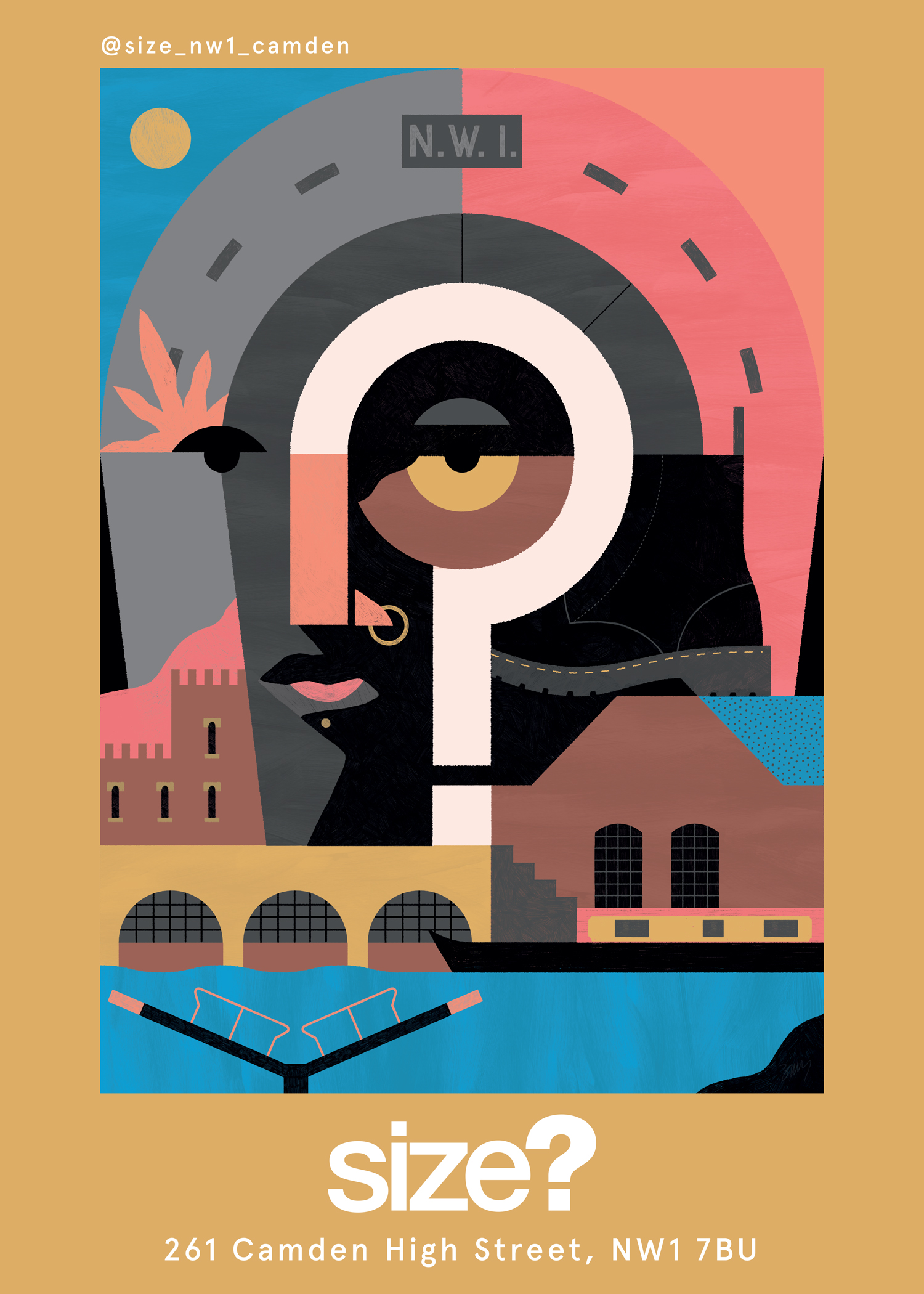
Billy Clark is a London based illustrator and graphic designer who’s worked with the likes of adidas, MTV and The Guardian, to name a few. Clark employs bold colours, shading and light manipulation to his pieces. Billy Clark’s work carries a clean, retro aesthetic, with influences ranging from Scandinavian minimalism to Latin Folk art.
Clark has interpreted our icon in his typical abstract style, using a mix of bold, block colours and shapes to create his piece. We find our question mark at the heart of the illustration, surrounded by Camden references throughout the piece, giving it a fresh vibrant feel.
We caught up with Billy to discuss work, influences and his illustration of our question mark:
Hello Billy. Your Work has been described as having a retro feel. What influenced this style of illustration?
My influences vary, and they go all the way back to a love of marvel comic books. I use a lot of shadow and dark areas to define forms which I attribute to this influence. I also generally tend to illustrate people in grayscale, which may naturally give a retro vibe.
You’ve worked with a varied mix of notable clients including MTV, The Guardian, adidas and The Financial times. Do you need to adapt your creative process with different clients, or do you use the same method with each?
Yeah I definitely feel you need to adapt from project to project. There are variables like timeframes, subject matter etc. that can affect the process. Saying that, once the idea is there, the execution of the work is pretty much the same.
What influences your work?
It’s hard to define exactly what influences my work. I’ve always loved illustrating people, particularly faces. Portraits and still lives and landscapes. This is probably too vague but I’m just more interested in real life than anything too ‘fantasy’.
You’ve referenced Camden heavily in the illustration you’ve created for us. Given the number of iconic landmarks, how did you choose the ones used in the illustration?
I’ve always associated Camden with a sense of attitude and punk culture, so I was keen to reference that. I also wanted to reference the lock, and in particular the Stables, with the large horseshoe shape framing the whole piece. These are the things that immediately come to mind when I think of Camden.
Share This: