size? Series – Kate Copeland

Share This:
The next artist we’re pleased to present as part of our size? series is Kate Copeland. Kate is a London based illustrator specialising in portraiture illustration. Taking inspiration from her mum, Kate started drawing from an early age. Copeland started taking her illustrations seriously after a discussion with a tutor who recognised her talent while at school. She later went on to study illustration at university. Since graduating in 2010, Kate has worked on several interesting projects, most notably with creative agency ‘Sagmeister & Walsh’, where she created illustrations to be printed on the bottom of a collection of bespoke whiskey tumblers; 14 illustrations – 7 deadly sins, 7 heavenly virtues.
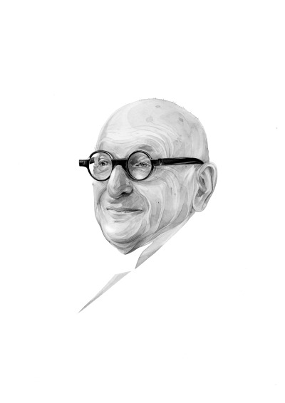
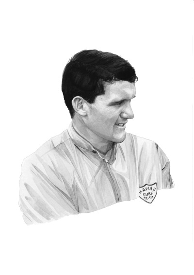
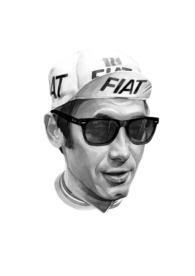
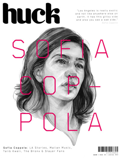
Kate’s method of illustration is minimal, textured and organic, using pencil to employ a portraiture style sketch drawing, also experimenting with shapes and composition. Copeland’s work starts initially as a sketch, before adding watercolour paint to it – the results are soft and detailed. Predominately a portrait artist, Kate has also ventured into the world of fashion, working with footwear giants Converse. Other clients include publications such as Esquire, GQ, Huck, The Guardian and The Independent, along with broadcasters the BBC and CNN, internet social news channel Buzzfeed and cycling specialists Rapha.
Copeland has presented our icon in her typical, individual style. Drawn in soft pencil our question mark is etched into the centre of large monolith – a piece of work that is open to interpretation. We caught up with Kate to explain more about her work:
Hello Kate, could you tell us a bit about yourself?
I’ve been a professional illustrator since I graduated from the Arts Institute at Bournemouth in 2010. I’ve lived in London since then – having previously grown up on the south coast – and have had the pleasure of working with a lot of talented art directors and dream clients on projects.
How would you describe your style of illustration?
It’s mostly black and white, semi-realistic, watercolour and pencil work. I suppose it could be described as quite traditional, in that the materials and techniques I use are fairly conventional, but I also try to experiment with shapes and composition, by cutting out fragments and shifting them around. I’ve started using Photoshop more for this purpose, it makes working much faster but I love drawing too much to ever work solely digital.
You have a very particular style of portraiture illustration. Where does this come from?
It’s developed over time but I’ve always tended towards realistic portraits. Previously I did very intricate pencil work, but have slowly moved towards a (slightly) more relaxed watercolour technique. That’s partly for stylistic reasons, but also for the sake of practicality. I do something like fifteen or twenty commissioned illustrations per month, often with tight deadlines, so I’ve had to temper my predisposition for everything being neat and tidy and perfect.
Could you tell us a little bit about the piece you’ve created for our question mark series? What was the inspiration behind the piece?
I tend to get commissioned mainly to draw portraits, so whenever possible I try my hand at artefacts, materials, and inanimate objects. I like drawing concrete and stone because the textures are interesting and somewhat difficult, and very different from what I normally do.
The initial concept for the piece was for the question mark to be a monolith, carved from stone, but this approach felt a little too forced. I wanted to keep the material and so the ‘?’ symbol became etched into the stone itself. This shape felt more organic and gave a more interesting form to the piece overall.
Share This: