size? series – Jiro Bevis

The next artist we’re pleased to present as part of our Question mark series is London based designer Jiro Bevis. The name may ring bells as soon as you hear it, as Jiro’s client list is long and ever evolving; counting Nike, Levi’s and Carhartt WIP as satisfied customers of his hand over the years. There are a few different facets to his work, so it may be more apt to coin him as a ‘designer’ in the broad sense of the word, rather than just pigeonholing him as a straight-up illustrator. Always culminating in a bold, graphic image, Bevis has a few graphic approaches that he can dip into dependent on the brief that he’s been set.
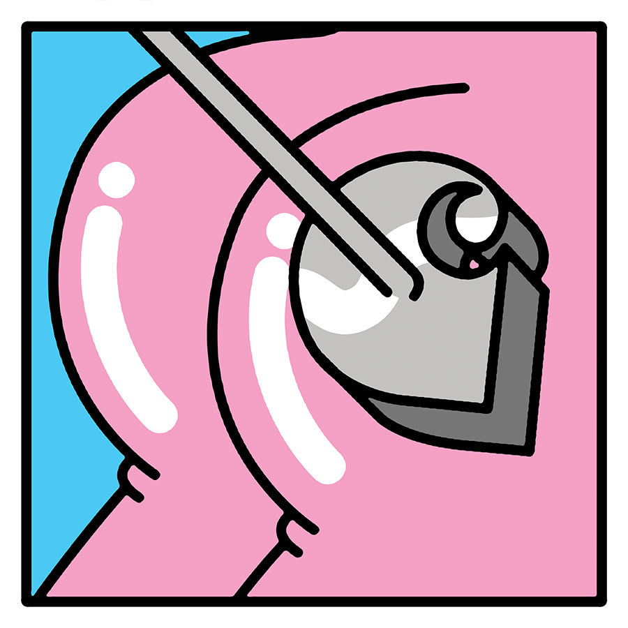
Firstly you have his some of his 80’s inspired art direction, pulling together considered graphic images to accompany articles for print. Next, some of the ‘collage style’ productions that bring together the worlds of both photography and illustration, resulting in a very manic mash-up that you need to try and make sense of. Typography is another string to Bevis’ bow, creating identity’s used by brands on graphic t-shirt prints and content pieces. and lastly, and probably the method he’s slightly more well known for is his bold, playful illustrative style. Two things are central to the artwork each time he employs this technique; vibrant, elaborate colours, and thick usrrounding outlines that help to seperate each hue concisely. Everything appears to begin from a rough doodle, and gradually develops once it’s been digitised and colour gets thrown into the mix.
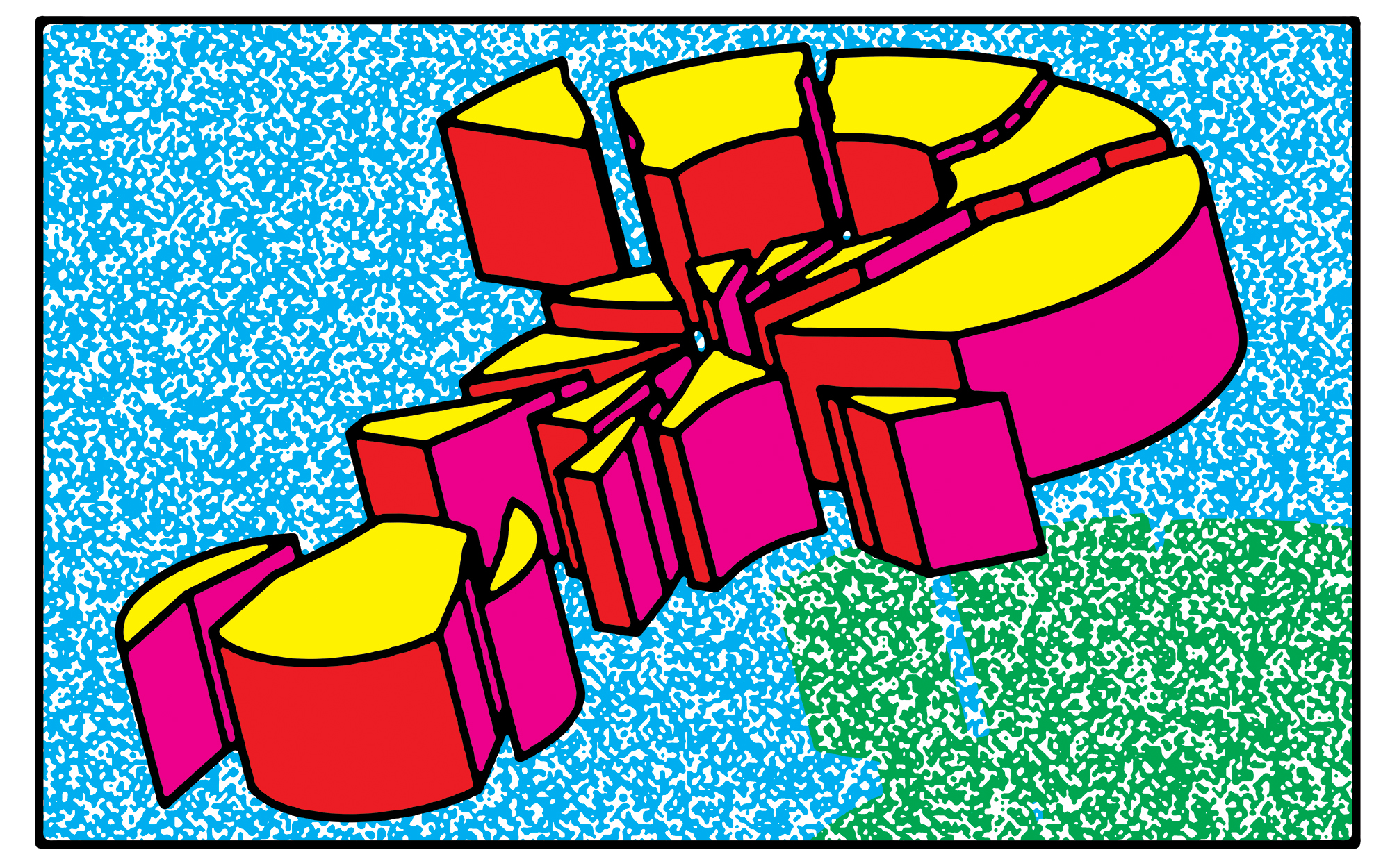
For his interpretation of our icon, Bevis made use of the final method we mentioned. Using red, pink, and yellow tones to colour-up the fragmented Question Mark, he’s built a thick slab of punctuation, seemingly shattered by the strike of a hammer.
You can find more information about Jiro Bevis’ work online here, and keep an eye on the blog next Sunday for the latest instalment in our series.
Test Pressing
Carhartt WIP
NTS Radio
Entercourse of the New Age
