5 Minutes with Illustrator Rob Whoriskey

Share This:

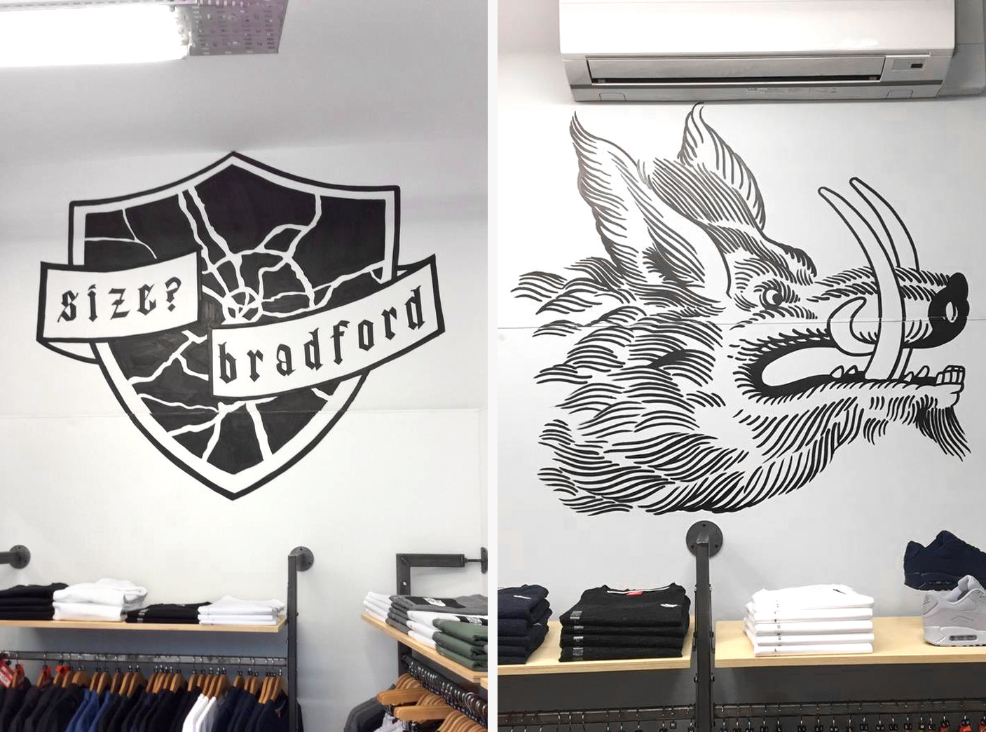
Our Bradford store recently got a little interior update courtesy of Irish born, London based illustrator Rob Whoriskey, who’s monochrome images have seen him create artwork for the likes of Fred Perry and designer Christopher Shannon in the past. We sat down with Rob to learn a bit about his working process, and where inspiration comes from to encourage him to put pen to paper.
Hi Rob. So to kick off, could you tell us a little bit about your background in illustration? Looking through your work over the past few years it seems to have taken on many forms. When did the obsession first take hold?
I was always the one who could draw at school so it was sort of decided for me by teachers that I’d go on to illustration. When I was little I was into everything: architecture, car design, comics, record covers. If I hadn’t gone through a classic rebellious teenage phase I’d probably be designing a Skoda right now. The reason I keep the medium and forms broad is probably because of those broad childhood interests.
Do you feel as though growing up in Ireland has had an influence on how or what you draw? Have your influences changed since moving to London?
It definitely had an effect on my work. I grew up in a very rural area, in a very out-of-the-way part of the west coast of Ireland. Quite often when I draw or paint, it’s objects, as there weren’t many people about when I was growing up – when I do draw people they’re always imagined. On top of having no neighbours we also didn’t have a TV until I was a teenager – so basically I spent my time imagining the outside world. My motivations for drawing have sort of stayed the same ever since. London has made me broader in my scope and also there’s competition here, which is always healthy.

In recent times you appear to be focusing on much simpler illustrations, applying your style to everyday objects. How do you go about selecting these subjects?
I’ve been drawing a lot of objects over the last five years as a way of organizing and assigning importance to the different things in my life. When you’re a child you draw things to make your life more interesting like soldiers, superheroes, dinosaurs, etc. I do this now as an adult, selecting the objects when they pop up as interesting in my head, but more as a way of organising parts of my life and creating meaning out of the things that happen to you along the way. There’s not really a set criteria for them – they can be meaningless or full of meaning.
In contrast to the linear ‘object’ orientated work, your lettering seems to have much more of a technical element to it, making use of implied textures such as dots and lines. Is type something you experiment a lot with alongside your illustrative works?
Yeah, weirdly I was terrible at typography at art school. Somehow it ended up being a thing I did to get away from boring illustration or dull logo jobs and ended up being some of my favourite work. I don’t know why I enjoy it so much, maybe it’s because letters have rules or maybe it’s because they’re usually quite quick to do. It’s some of my favourite work though.


Do you have a preference towards either or do they sort of work hand in hand with your style?
I have a preference for drawing because I feel like that’s ‘my thing’ but more often than not the typography is the thing I’m most happy with. There are lots of illustrations that I’ll never show anyone, whereas it’s not quite the same with type.
With so many illustrators these days working digitally, a standout point of difference with your work is the hand drawn element. Do you try and keep the work as tangible as possible and only use digital as a print and presentation tool?
I tried to keep everything hand drawn when I was at art school, then just continued afterwards because there was so much terrible illustration that looked like pastel blobs or faux-childish stuff done in Illustrator – I did just use digital as a presentation tool. Now it’s different – there’s some pretty good stuff about. That said, I’ll definitely be doing more obviously digital stuff in the near future along with the hand drawn stuff.
Would you ever try and channel your way of seeing things through photography or moving image, or do you think you’ll stick with illustration for the foreseeable future?
Drawing is just the thing I’m best at and that’s why I use drawing to communicate the idea – I’d probably just find the objects and photograph them if I couldn’t draw. The idea is most important, drawing is what I have the most style at, so that’s what I use. But I would like to collaborate with someone in another field soon.
For the most part you seem to work solely in black & white, is this a conscious decision or just something that you sort of fell into a habit of using?
Maybe every five years or so colour comes or goes in my work – I’ve no idea why. For the last five it’s been very black and white but it’s about to get a bit more colour-heavy. All my paintings are colour enamel on Perspex or glass; I’ve been doing them alongside other projects for a few years so I should have more colour to show pretty soon.

You’ve worked with Fred Perry and Christopher Shannon on projects in the past, how different a process is it interpreting your artwork onto a 3D object rather than straight onto a flat sheet of paper?
When I worked with Christopher he took some pattern-y drawings of mine and made them into actual patterns, so I didn’t have a huge role in how they worked on the clothes, but I really liked the results. With Fred Perry, I drew directly onto the shirt for a charity event for the Amy Winehouse Foundation, so it was a bit nerve-racking trying to get everything to fit and not mess up the drawings. Two very different processes, both were good fun.
Could you tell us a bit about the artwork you’ve just created for our Bradford store? What’s the story behind each element?
The work I did for size? Bradford was about the legends behind the creation of the town; a knight that killed a rampaging boar at the behest of a prince. It fits in with some previous work that I’ve done where I’ve played on the idea that clothes are armour, especially in the context of streetwear and youth.
You can find more of Rob Whoriskey’s work on his Tumblr here, and follow his Instagram for updates and escapades here.

Share This: