adidas Originals Archive News – An Interview with Gary Watson

Share This:

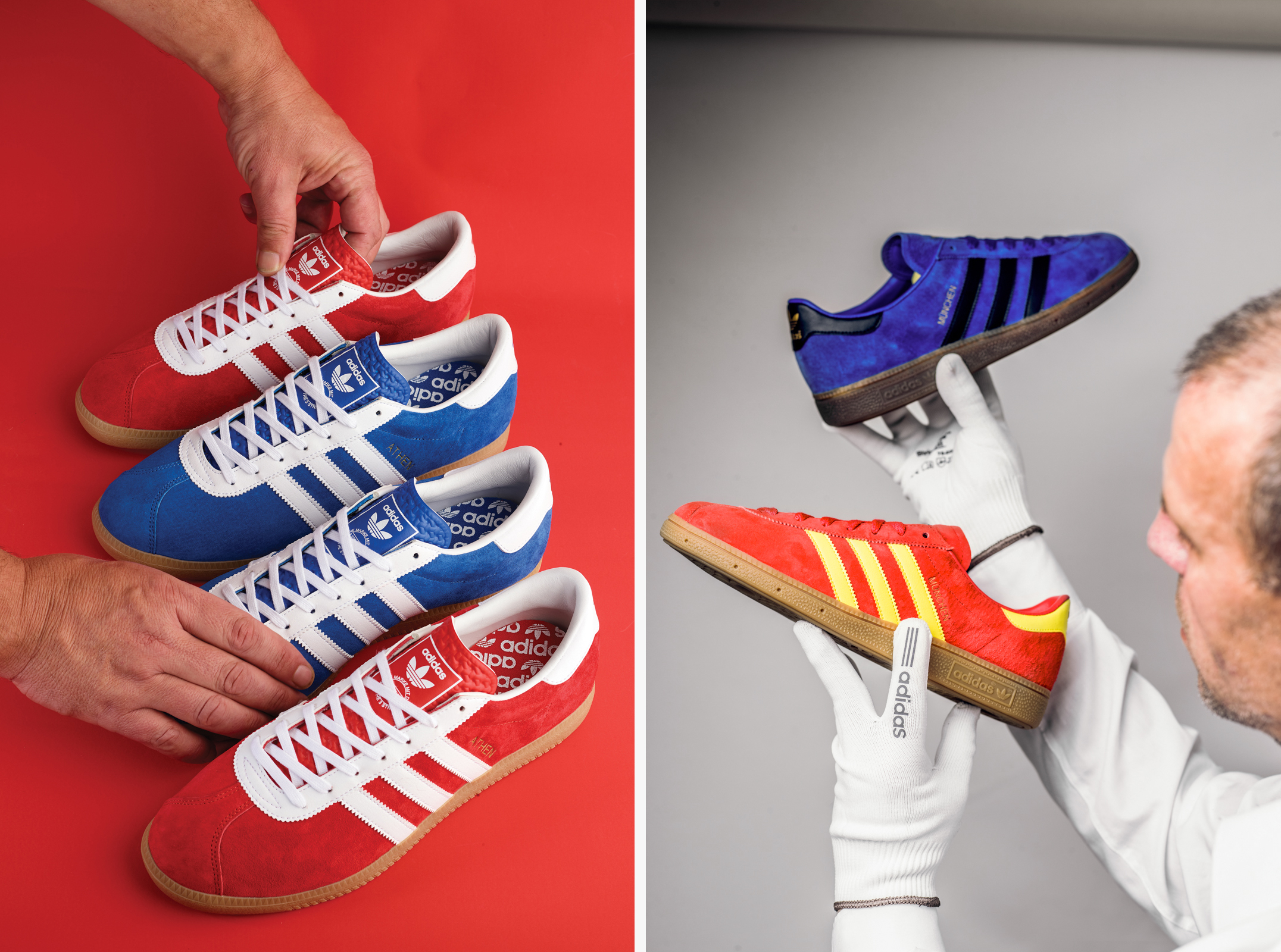
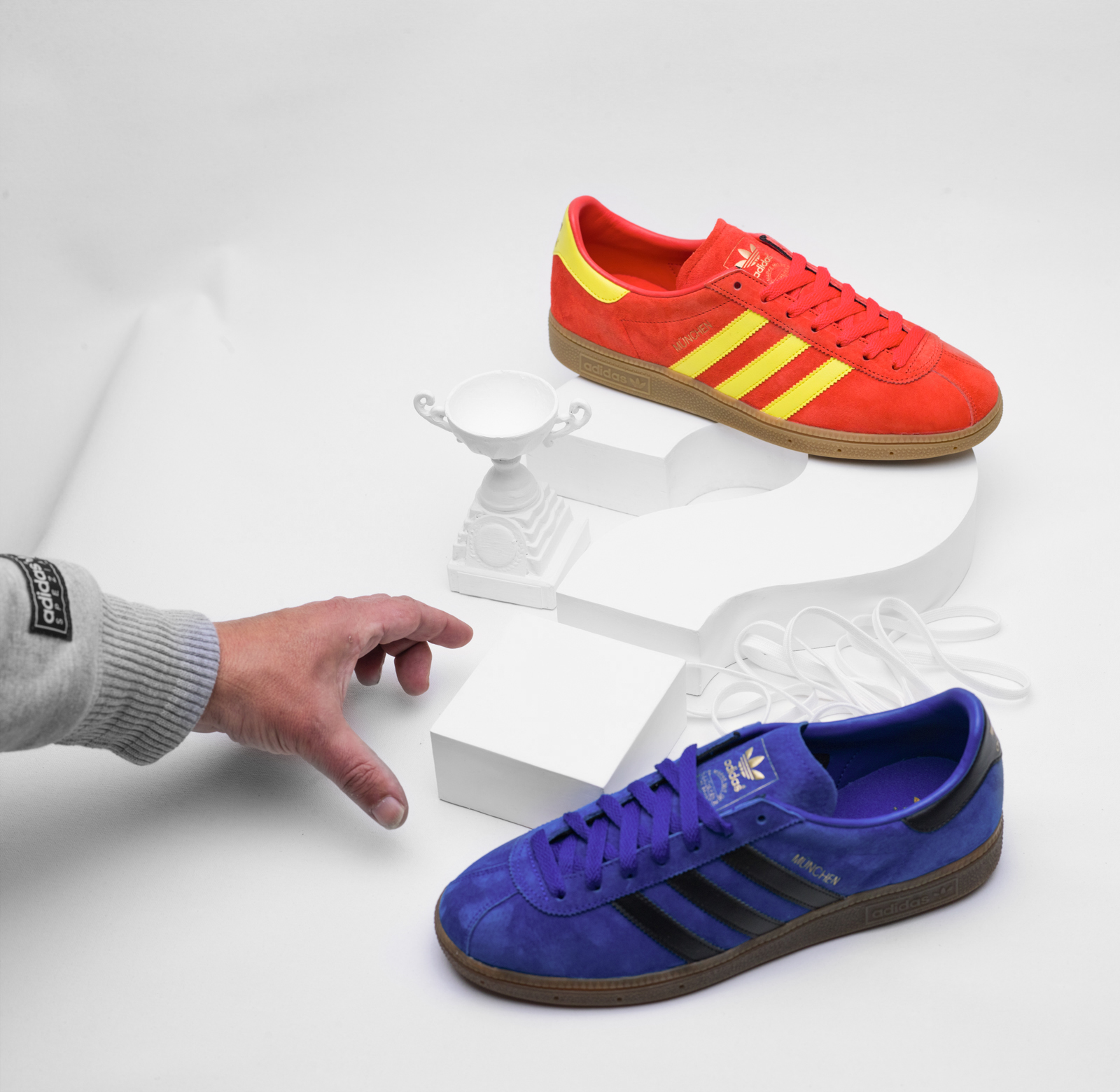
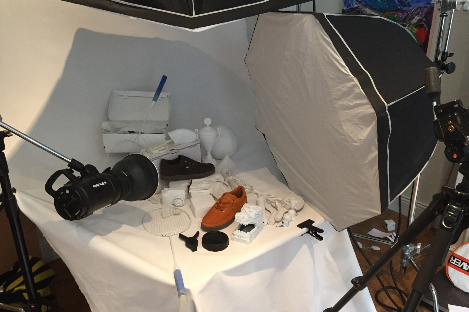
As well as the shoes themselves, the imagery that accompanies them is an important element of our Archive project to add a bit more context to each release and help tell the story behind each product. The imagery has been produced much in the same way as it was back in the 80’s & 90’s for the true feel of authenticity. Designer Gary Watson has been key in helping develop the visual identity of our ongoing project with adidas Originals, so we sat down with him to find out a bit more about his working process and his own obsession with the three stripes.
Hi Gary, could you tell us a bit about your background within design and the creative industry on the whole. Where did you first start out?
I left school at 16 and worked within the newspaper industry, serving a four year apprenticeship as a graphic designer. This was pre-desktop publishing days, and I sat at a drawing board sketching visuals for the sales team to pitch to advertisers. I started working on other projects outside of my day job, doing illustrations for fanzines and indie bars in the local area, mainly to get some extra cash to spend on football, going out, and of course, adidas!
 How did you first discover adidas Originals products?
In a shop window in the school lunch hour, a pair of little French numbers, electric blue, white sole, white stripes, white tongue, with a boxed Trefoil on the tongue, and the words ‘Jogger – Made in France’…
What aspect of it attracted you the most?
Everything about that shoe in the window looked amazing. It was blue (pretty much up to that point most trainers I’d seen were black or white) and that was the initial attraction, at least until I finally managed to save enough dinner money to get a pair. When the sales assistant brought the box out in my size I was more interested in its design, with all the stick sports figures all over it, than the contents! It certainly started a greater love affair with adidas Originals and its branding.
Is there any era of adidas Originals in particular you favour?
I love the style of the brand advertising. The ‘50s and ‘60s era was great, their use of colour and type, and the hand drawn sketches of the shoes reminds me of my pre-mac apprentice days. Things always come back around and some of them would look contemporary or even futuristic now. With computers playing such a huge role in design over the past few decades, anything crafted/hand drawn now looks ultramodern, it’s like we’ve come full circle. I also love the early pre-trefoil versions of the adidas logo, and the white shoe boxes of that era with their amazing labels. I could go on and on!!
What would you say is the oldest pair you’ve got sitting in your collection?
I don’t have what I would call a collection these days; I’m a fan who has been a collector, so I know what it means to people who do. Don’t get me wrong, I have a lot of shoes but I don’t collect shoes. I still have old pairs though, but nothing too extravagant, 40 years old or thereabouts!
Any specific collections/series of shoes you’re a big fan of? (Leisure/City etc.)
I’m quite partial to an ‘80s indoor shoe. I had a 1987 German catalogue when I did collect, and tried to own all the men’s Indoors from those pages. I wasn’t that far away either at the time!
When did you first begin working alongside adidas Originals?
I worked on the adicolor launch in 2003 and then started doing pieces for books and projects that adidas were involved with.
Was it a bit surreal to be working with the brand you’d been a collector of for so long?
It’s great to get to work on a brand that I’ve had an interest in for most of my life, but it does open your eyes to the amount of behind the scenes work that goes into each shoe model or collection of clothing. I feel very proud that I get a chance to pay homage to the brand through my work; I’m a ‘lucky get’ as my mates in Lancashire say!
Your work often harks back to advertising campaigns and catalogues from the ‘80s & ‘90s. What is it you enjoy most about the style of imagery from those decades?
The most important thing is brand authenticity; if we are calling upon and referencing the rich heritage of the brand then the same should apply to how these items are then presented to the public. Maybe if the imagery from those eras was really poor I’d feel differently about things, but it isn’t and is there to call upon. It’s always great to reference and give a nod to that body of work whilst producing something that is modern.
Is there that one pair in particular that you’ve seen, wanted, but have never been able to get your hands on?
With the explosion of social media groups there are just that many old ‘new’ models popping up that I’ve never seen before and would love to own. Some of the vintage kids’ shoes that came out of Carlos Ruiz’s Shop in Argentina were amazing—I’d love to own any of those in adult sizes!
You’ve been working with us on the imagery for our latest Archive series, what’s been your favourite release we’ve brought back in previous years?
Quite recent really—the Tobacco Rivea was a great reissue, lovely colours, superb quality suede, and the shape was bang on to the original. I definitely think the bar has been raised in the last couple of years with the reissues. People who collect and buy the adidas Originals brand aren’t fools; they have a strong knowledge of the brand and are very opinionated regarding the minor details. This has been duly noted and implemented in the standard of shoes being released.
Are there any shoes that haven’t been reissued that you’re still patiently waiting for?
Jogger of course!—would love to see them in a French style stickmen box though, and most of the indoors from the 1987 catalogue would be good too!
Share This: