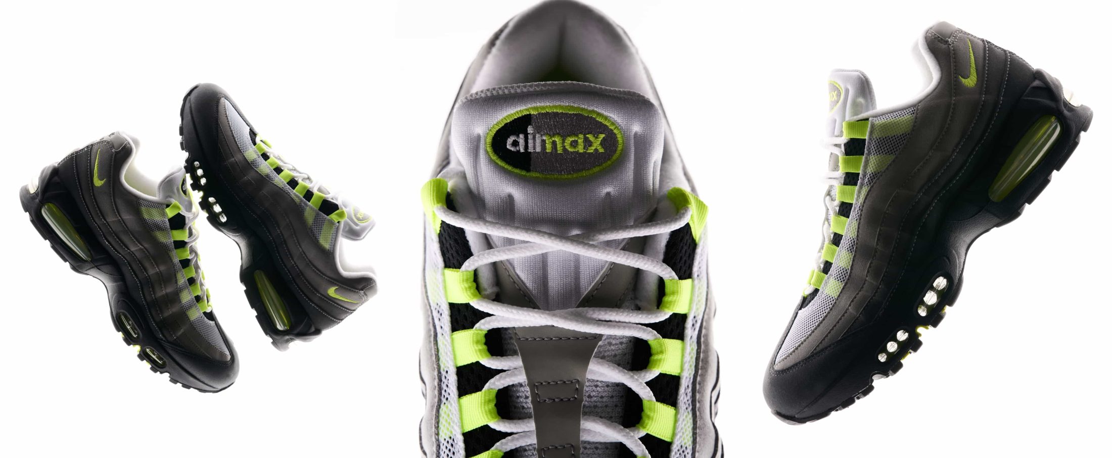
ManvsMachine explores the infinite possibilities of Nike Flyknit (via Itsnicethat)
Following on from their recent work on the Nike Air Max Day campaign, design blog Itsnicethat caught up with commissioned studio ManvsMachine to talk about the Flyknit technology film they produced for Nike’s 2016 Innovation Summit.
The blog spoke to director Antar Walker and Mike Alderson, creative director, to find out more about the processes and concepts behind the 80 second film.
What was the brief?
Flyknit is a cornerstone of product innovation for Nike, we were tasked with making a cinematic film that demonstrated this flexible and exciting technology for their 2016 Innovation Summit. Working closely with Kevin Coatman at Nike we have also been tasked with consolidating Flyknit as a brand, creating an identity intended to be used across all Flyknit products in the future.
For us this was an exciting opportunity to not only embrace the product film of the innovation summit, but look at it as a bigger brand, an identity, and how we communicate that within a hugely established sportswear company.
What was the concept behind the film and video?
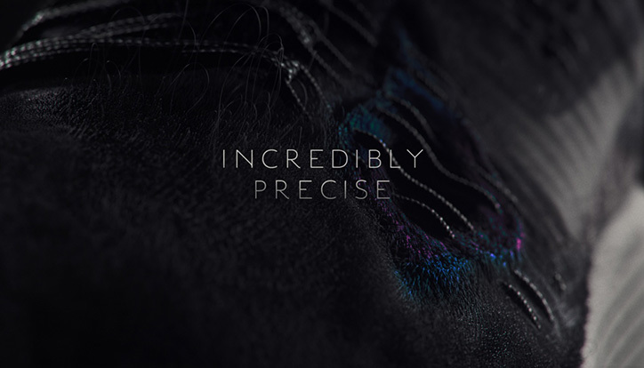
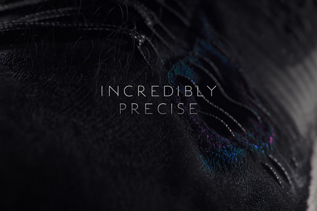
Fllyknit is a very clever piece of technology, the idea was to explore four different ‘pillars of innovation’. The journey starts with a tease of the identity, the ‘infinite possibilities’ of Flyknit. A single thread then begins to build, and take on the different attributes of Flyknit throughout the film; strength, lightweight, protective and precise.
How did you create the video?
We created the film using a mixture of techniques, the main tool being Houdini. We’ve been experimenting with the amazing capabilities of the procedural side of Houdini for a while, and this seemed like the perfect opportunity to apply them to a commercial project. Let’s just say it was new ground, which we love treading, but quite a few late nights and early mornings.
How did you develop the typeface to go with the film?
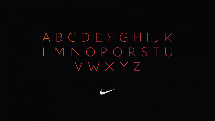
We loved the mathematical and technical precision of Dalton Maag’s – Objektiv Thin. it felt wonderfully balanced with a more human & organic sensibility – to us it echoed the Flyknit ethos.
Our goal from there was to customise it from the ground up, peppering a touch of Flyknit across their letter forms. This lead us to introduce the looser flyknit-esque curves and the more structural and overt 45º angles that we derived from our infinity logo. We reached out to Dalton Maag, and they’ve agreed to develop the font into a fully functioning set exclusively for Nike Flyknit.
How will the project be further developed?
This is just the beginning. We’re currently working on building the Flyknit brand identity from the ground up. All elements have to be considered, from print, to retail, digital and motion. We’re really excited and can’t wait to start the next chapter of the Flyknit universe!
