Paul Thurlby

Share This:
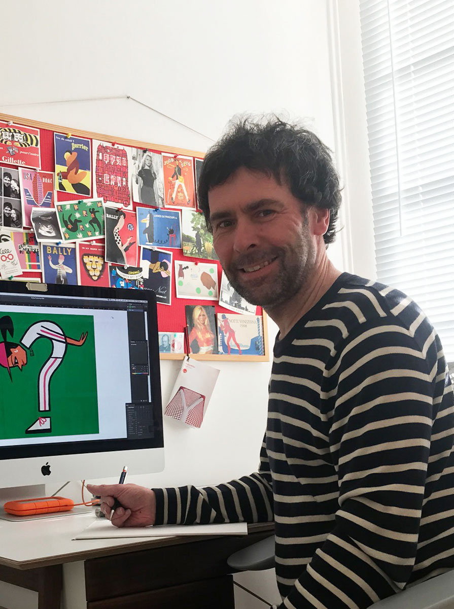
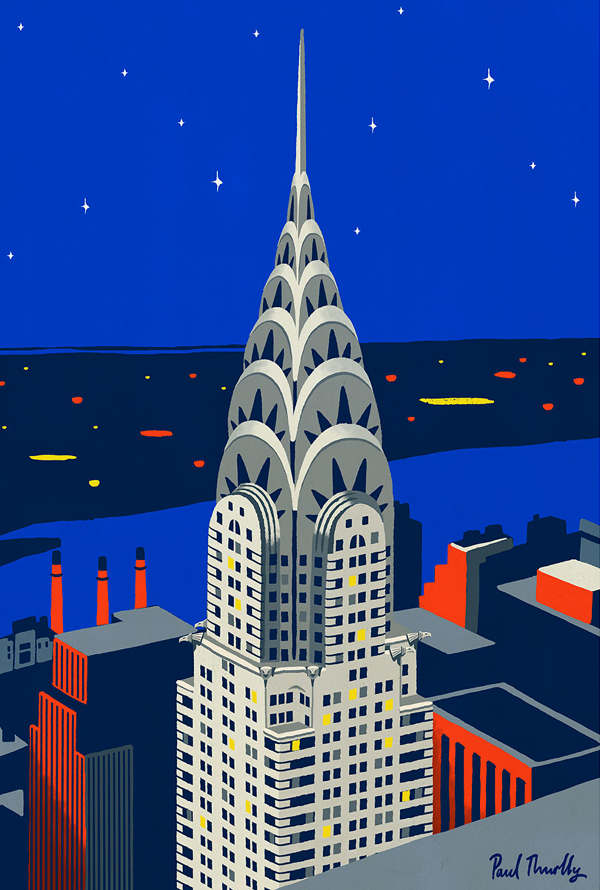
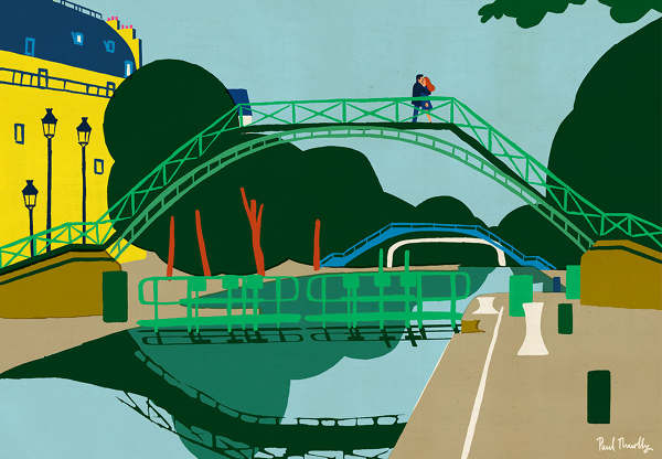
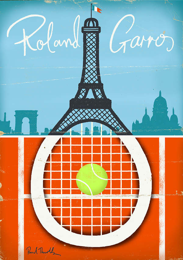
Paul Thurlby is an award-winning illustrator, originally from Nottingham, now based in London. Describing himself as having a ‘retro-modern’ style of illustration, Paul applies colourful, contemporary and sometimes humorous style to his works. Amongst various personal and corporate projects, one that the Paul is particularly proud of is his John Lewis 2017 summer campaign advert, where he created a set of colourful illustrations to represent ‘National Treasures’. Paul Thurlby has been commissioned by a host of premier clients, some of which include; John Lewis, The National Gallery London, Monocle, Amstel, The Guardian, Nokia, It’s Nice That and The New Yorker.
Paul’s image for size? series is of a girl taking a closer look at the state of her brand-new trainers, in the shape of our iconic question mark.
We sat with Paul to talk about his career, inspirations and his artwork for size? series.
Hello Paul, could you tell us a bit about yourself and your style of illustration?
I’m originally from Nottingham and spent 8 years in London before moving to Brighton last summer. My work is bold and colourful and I’ve been illustrating full-time since 2006.
You’ve worked on aa number of high-profile campaigns. Which are you most proud of?
Maybe, surviving an intense 3 weeks working 8am ‘til midnight every day on 6 (7 if you count the one I had to scrap on completion) window designs for John Lewis and their summer campaign ‘National Treasures’ last year. I also worked on some additional characters and a pattern for their interiors. It was fantastic that they asked an illustrator to do this for the first time and that they showcased me, the illustrator. Though it was strange at first to see a picture of myself in the window on Oxford Street! Otherwise, the Sarson’s campaign from a few years ago was very memorable.
Can you name 3 artists you admire?
While I do admire a good few contemporary illustrators, I take my inspiration from the past. Having a love of posters, I particularly like the work of Bernard Villemot, Abram Games and Leonetto Cappiello. Villemot approached his posters like they were paintings, Games was a master of ideas and Cappiello is considered the father of the modern advertising poster.
What’s the weirdest thing in your studio?
I have a cat and 3 seagulls from the John Lewis summer campaign.
What was the thinking behind the artwork you’ve presented for size?series?
When asked to create a question mark for size? I immediately knew how I would approach it. Using the shape of the question mark to create something else. Yet, still be very recognisable as a question mark.
Share This: