5 Minutes with Illustrator Tim Easley
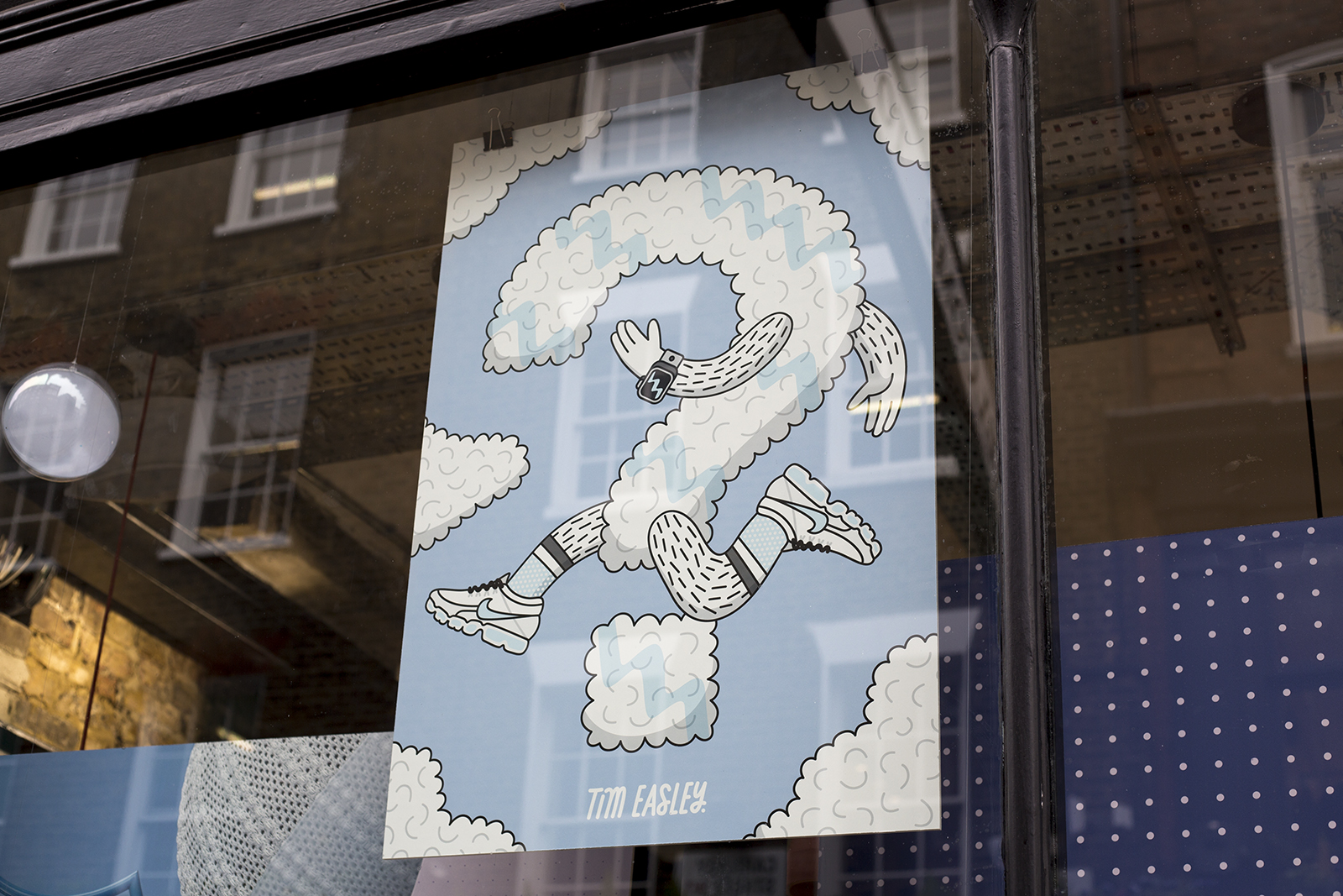
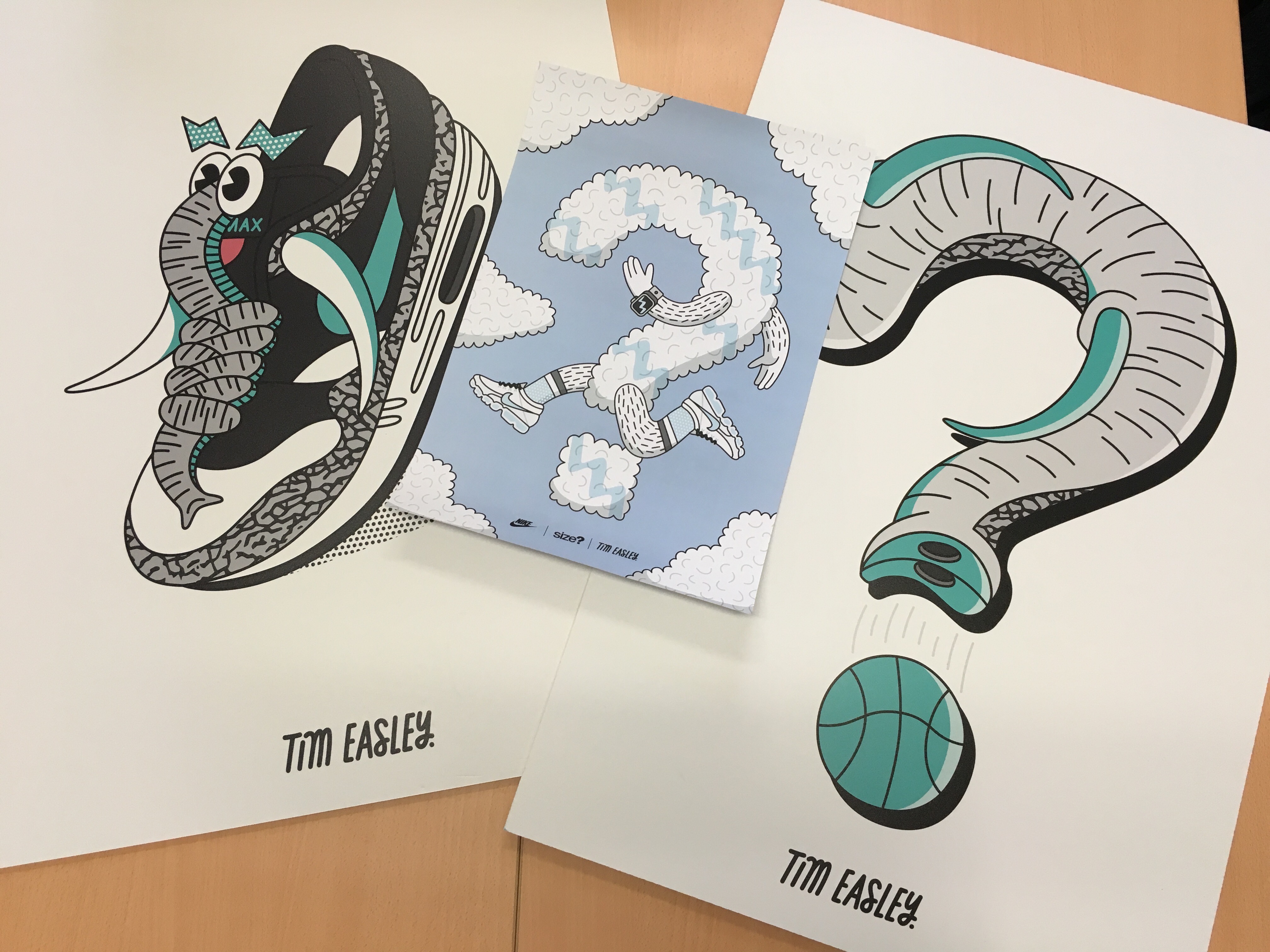
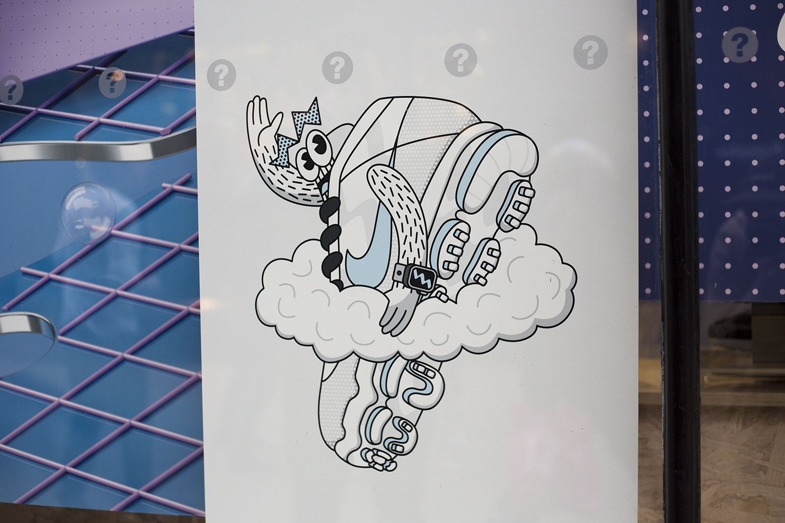 To add a personal touch to our Air Max Day window installations seen around the country, we enlisted the help of London based creative Tim Easley to create bespoke artwork based on the themes of each of the shoes releasing over Air Max month. Having worked with Nike on several projects in the past, Tim’s no stranger to recreating their footwear in his own playful style.
We spoke with Tim to find out a bit more about his working process and how he came up with his direction for the final artwork.
Q: Hi Tim, could you give us a bit of a background overview of you and your work, and how you got into design/illustration in the first place.
A: Hi there! I’m Tim and I’m a self taught designustrator from London. A designustrator is a designer and illustrator rolled into one, but fused metaphorically rather than physically via the skull or hip. To clarify, I’m one person, but do two jobs. Like a working mum. My work consists of a lot of doodles, hand lettering, characters, bright colours, and often an inordinate amount of concentration. I became a designustrator because it’s dangerous and manly.
Q: Which passion came first, footwear or illustration?
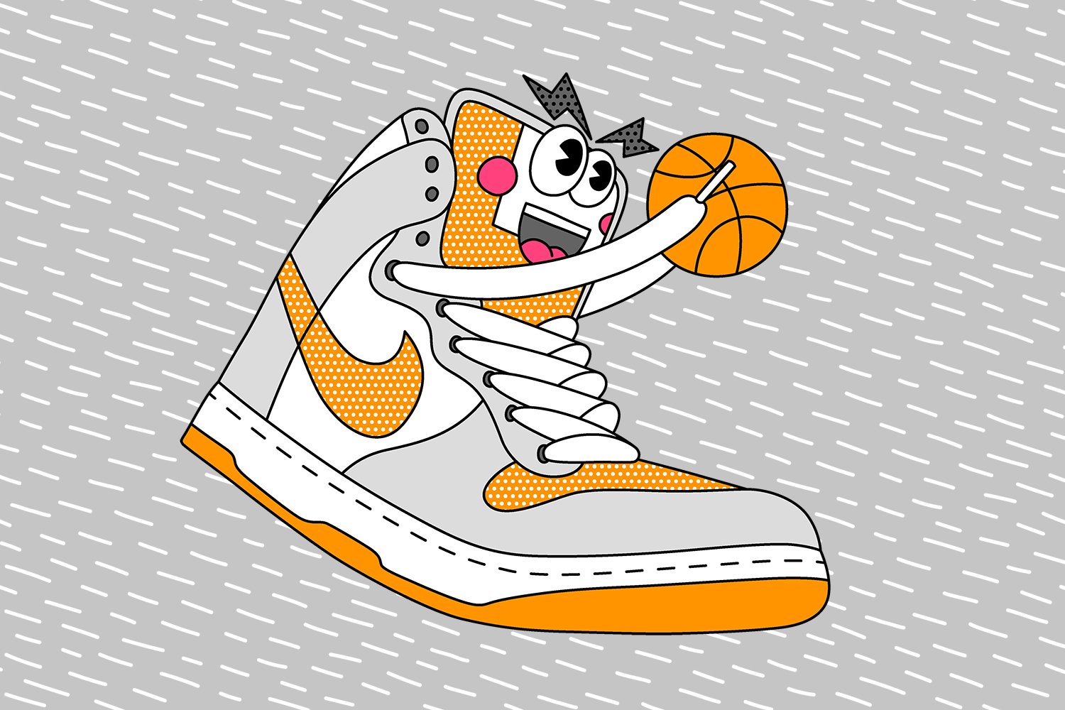
A: Definitely the footwear. I used to enjoy drawing as a kid but I never really considered it as an actual career until relatively recently. The first proper print I made was back in around 2004 and featured every single Nike Dunk High that’d been released up to that date – nearly 100 different colourways! It was really popular, so I ended up doing more designs, and got into the illustration side of things from there.
Q: Your work nowadays is predominantly digital, does every idea still start from an initial sketch with pen and paper and develop from there?
A: Most of my client work is digital now since it’s much better to e-mail illustrations that can be resized, rather than faxing them or sending scrolls carried on horseback. I used to do most of my initial sketches on paper, but even those are done digitally these days too, since it saves paper and helps me work a lot quicker, which in turn makes my clients happy.
Q: Is there a preference of working with either lettering or illustration? Or do you think both have a hand in helping with the other?
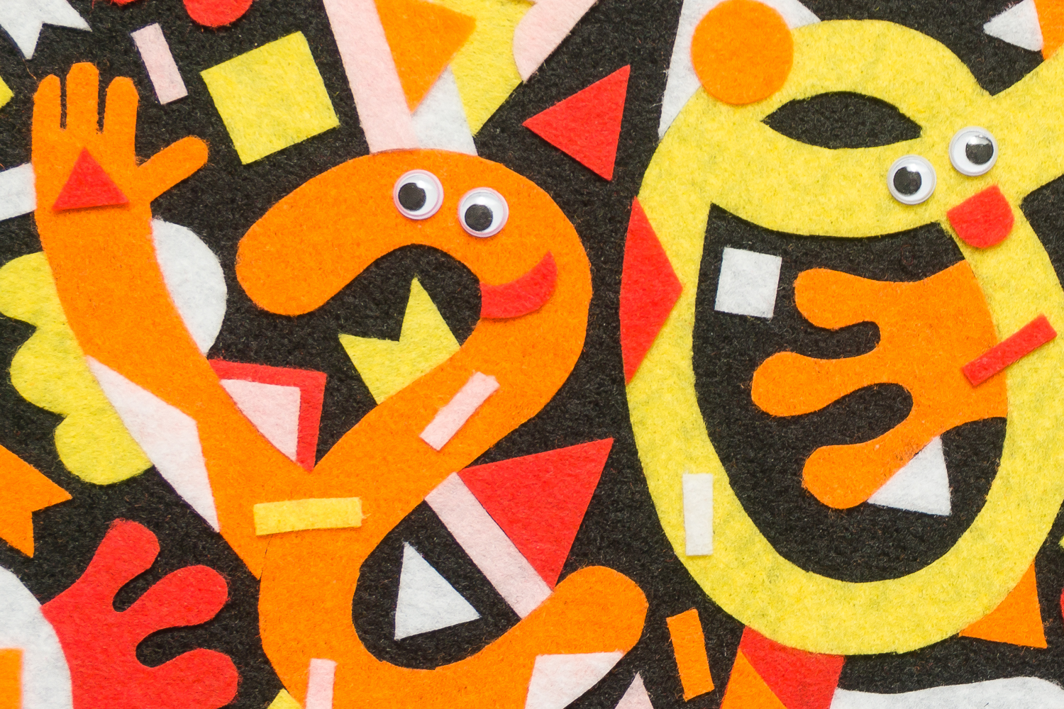
A: I see them as pretty much the same thing. To me they’re both drawings conveying ideas. I love doing lettering though, especially when it involves more illustrative elements like the size? logos I did, because they’re way more fun than plain lettering. I often like to see how far I can push letters or words, even to the point where they become illegible. I mean who needs to be able to read words, right?
Q: You were once one of the original masterminds behind Crooked Tongues I believe, how did that all come about in the first place?
A: I had a record store in the late 90s and used to sell vintage sneakers in there, alongside records of course. I met some guys through the store who were running an online magazine, and I pitched the idea of Crooked Tongues to them. It was originally going to be a section of the magazine’s website but it ended up being a separate company and online store. We actually launched as the first size? store opened round the corner from us in Carnaby Street. We really should have set up a cool rival gang thing. With finger clicking and dancing.
Q: When creating client artwork do you prefer to work to the guidelines of a brief or enjoy having a lot of freedom to play around with?
A: I like to work to a rough brief, but it’s also really nice to be trusted to do what I feel is best, especially when it comes to palettes! I think that when the brief is too tight and specific you end up just being a pencil operator rather than an illustrator. Also I’m always right, so there’s that too. Ahem!
Q: Have you got any upcoming projects you’re currently working on that you’d like to share?
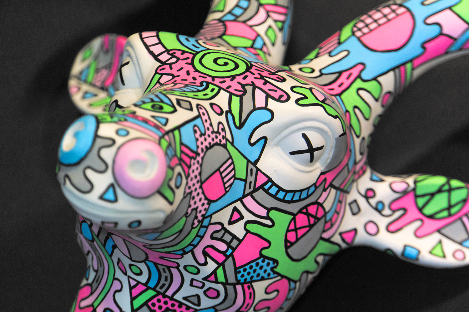
A: The biggest project I’m working on right now is putting on a solo show, so I’ve been doodling on a lot of things including Nike sneakers, basketballs and skateboards. Hopefully that’ll happen some time this year! I’m also using that as a chance to work with some mediums I’ve not used before, so that’ll be interesting and possibly hilariously disastrous.
Q: Tell us a bit about your ideas process behind your Air Max Day illustrations for us?
A: The first thing I like to do is lay in bed and think of as many weird things as I can. I feel it’s always best to start off really weird and reel it in gradually, rather than start off safe. I’ll then do some rough sketches to get some feedback, stomp my feet and sulk in the corner when any ideas are rejected, then eventually reach some kind of mutually agreed middle ground and get the final images drawn.

Q: What are a few of your favourite Air Max Styles?
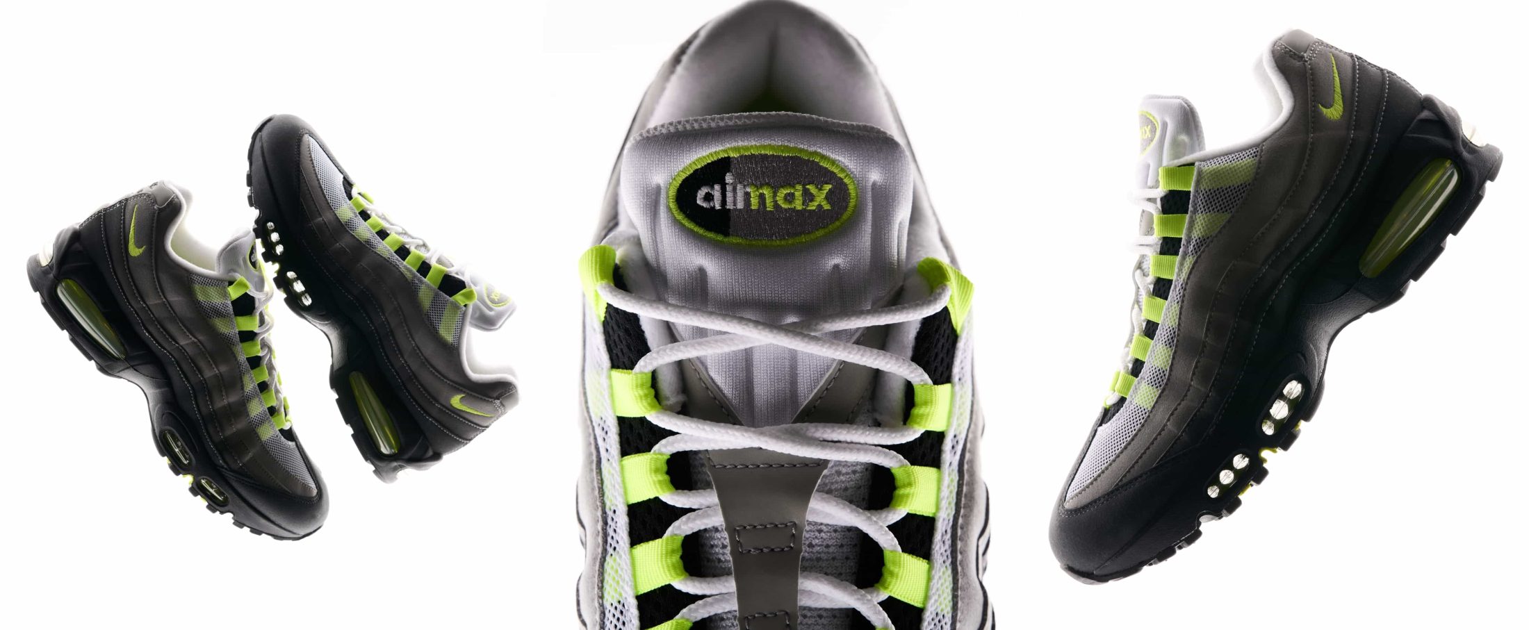
A: The Air Max 1 is obviously a favourite, they’re a classic design and hard to beat, especially with an array of never-endingly awesome colourways. The 180 is another favourite of mine because they were so futuristic looking when they came out, the sock inner was really comfortable, and I always half expected the air unit to light up and take off. Lastly I love the BW, I think it’s a real slept on silhouette especially when it comes to collabs, and I think there’s still a lot of mileage in it in terms of potential colourways.
Q: Are you a fan of the classics or are you into some of the more obscure releases from the past 30 years?
A: I do love the classics, but I’m also a fan of some of the weird ones. I used to have a big collection of Nike Kukini, including the Coca Cola version. They weren’t exactly the most popular shoes but I loved them even if nobody else did! I also thought the Nike Sock Dart were amazing when they were released. But again, everyone seemed to hate them at first. I’m usually a big fan of the bright colourways or obnoxious patterns that nobody else wants.
Q: What was the first pair of Air Max you ever purchased?
A: That would have been the leather Air Max 1 in black/white in 1992. I could never afford the original suede or leather ones when they came out in 1987/1988, and I wasn’t tough enough to rob anyone for them, so the first ones I had were the 90s re-issues. I wore them until they literally fell apart!
Q: VaporMax is quite a radical move for the franchise, where do you think the technology can be taken next?
A: I’m always worried about people stepping on my sneakers, so it’d be great to see airbags being added to the fromt of the sole units. It’d help protect the shoes from builders and grubby children on the tube. Besides that I’m not really sure where the air max franchise can go, seeing as the VaporMax sole is entirely made of air. Perhaps we’ve reached max air max?
Q: If you were to illustrate your idea of a perfect shoe (no limitations!) what would it encompass?
A: They’d be mostly grey, have 3M reflective elements, some glow-in-the-dark, animal print, gum or clear soles, bright highlights, and some sort of gradients. They probably sound aesthetically disgusting, but trust me they’d be the best shoes ever made. Nike, if you’re reading this, hint hint!
You can find more of Tim’s work online here, and follow his escapades on Instagram here.


