REBLOG! Nike World Cup Fonts

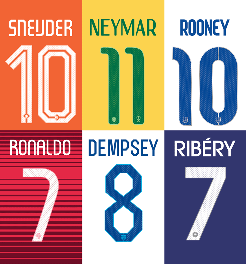
As the World Cup moves into its second half, we look at the process in which Nike and their design team designed original, bespoke fonts for their teams performing.
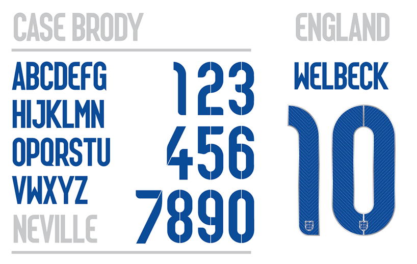
Each font has been constructed with the ethos and heritage of the country at the forefront, tailoring each aspect to reflect both tradition and history. With England’s kit for example, Nike wanted an element of flair and a ‘workmanlike reliability’ to be portrayed in the text. Similarly, they incorporated a faint pin stripe into geometrically constructed numbers, conveying a sense of British architecture.
Similarly, for the French strip, Nike re-worked and stylised the typically Parisian ITC Avante Garde font, giving the classic script a new lease of life. The full interview with Stu Mcarthur (Design Director at Nike Football) can be found below..
Q: How are fonts assigned to each team?
SM: We design unique fonts for the best Nike teams as an extension of the ‘pride’ elements of each kit design. the fonts are created with a focus of being culturally relevant, as well as playing a role in completing the kits overall design. functionally, we are also looking to improve legibility for the spectators at home and in the stands.
Q: When are external typographers brought in to help?
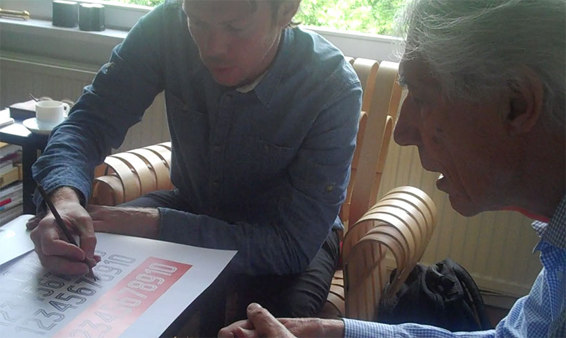
SM: It’s not something we usually do but with this summer’s tournament, we wanted to extend the national pride elements of the design and this felt like a great way to do that. Working with Neville Brody on England’s font was a huge honour – he’s one of the best living British typographers and he’s a huge football fan. In terms of the typeface for the Dutch kit, Wim Crouwel is a friend of Nike and has been working with us on some other projects, so it felt natural to bring him on board.
Q: How do you justify the cost and time of developing a new custom typeface?
SM: For each federation this is the pinnacle moment for their players, fans and everyone carrying that country’s passport! We see this element of the design as a vital piece of the team’s storytelling.
Q: what criteria is used to strike a balance between originality and legibility?
SM: This is where you earn your wages as a designer, firstly the font has to be original & relevant, does it resonate with the country or team? Does it fit with Nike’s overall direction? We want to create a beautiful unique font that resonates with the players & fans alike. In the case of the Dutch typeface we followed Wim’s modernist typography rules, focused on spacing letter shapes purely to be legible while also creating a modern look. This style has been a modernist (and a niche) discussion in the Dutch graphic world for the past six decades.
Q: What FIFA regulations do the typefaces have to meet in order to be used?
SM: We have to meet certain requirements in terms of the stroke widths, colours, legibility and so on – the rulebook is quite thorough but it never proves too challenging to the process.
Q: What’s your favourite Nike typeface?
SM: We are very proud of the England and Holland typefaces but my personal favourite is the one we worked on for France. A stylised version of ITC Avante Garde, which fits the character of the french team perfectly. The font is wider than usual, so the first time we used it on the new marinière (away) shirt we had to anticipate the width of the letters to ensure each player’s name would fit in a straight line across the shoulders while vertically staying between the hooped stripes on the shirt.
To read the rest of the feature in full head over to Designboom Magazine.
